How to use <apex:inputCheckbox> in Visualforce Page?
<apex:inputCheckbox> :
An HTML input element of type checkbox. Use this component to get user input for a controller method that does not correspond to a field on a Salesforce object.
This tag supports following attributes:
Attribute
|
Description
|
accesskey
|
The keyboard access key that puts the checkbox in focus. When the checkbox is in focus, a user can select or deselect the checkbox value.
|
dir
|
The direction in which the generated HTML component should be read. Possible values include "RTL" (right to left) or "LTR" (left to right).
|
disabled
|
A Boolean value that specifies whether this checkbox should be displayed in a disabled state. If set to true, the checkbox appears disabled. If not specified, this value defaults to false.
|
id
|
An identifier that allows the checkbox component to be referenced by other components in the page.
|
immediate
|
A Boolean value that specifies whether the action associated with this component should happen immediately, without processing any validation rules associated with the fields on the page. If set to true, the action happens immediately and validation rules are skipped. If not specified, this value defaults to false.
|
label
|
A text value that allows to display a label next to the control and reference the control in the error message
|
lang
|
The base language for the generated HTML output, for example, "en" or "en-US".
|
onblur
|
The JavaScript invoked if the onblur event occurs that is, if the focus moves off of the checkbox.
|
onchange
|
The JavaScript invoked if the onchange event occurs that is, if the user changes the content of the checkbox field.
|
onclick
|
The JavaScript invoked if the onclick event occurs that is, if the user clicks the checkbox.
|
ondblclick
|
The JavaScript invoked if the ondblclick event occurs that is, if the user clicks the checkbox twice.
|
onfocus
|
The JavaScript invoked if the onfocus event occurs that is, if the focus is on the checkbox.
|
onkeydown
|
The JavaScript invoked if the onkeydown event occurs that is, if the user presses a keyboard key.
|
onkeypress
|
The JavaScript invoked if the onkeypress event occurs that is, if the user presses or holds down a keyboard key.
|
onkeyup
|
The JavaScript invoked if the onkeyup event occurs that is, if the user releases a keyboard key.
|
onmousedown
|
The JavaScript invoked if the onmousedown event occurs that is, if the user clicks a mouse button.
|
onmousemove
|
The JavaScript invoked if the onmousemove event occurs that is, if the user moves the mouse pointer.
|
onmouseout
|
The JavaScript invoked if the onmouseout event occurs that is, if the user moves the mouse pointer away from the checkbox.
|
onmouseover
|
The JavaScript invoked if the onmouseover event occurs that is, if the user moves the mouse pointer over the checkbox.
|
onmouseup
|
The JavaScript invoked if the onmouseup event occurs that is, if the user releases the mouse button.
|
onselect
|
The JavaScript invoked if the onselect event occurs that is, if the user selects the checkbox.
|
rendered
|
A Boolean value that specifies whether the component is rendered on the page. If not specified, this value defaults to true.
|
required
|
A Boolean value that specifies whether this checkbox is a required field. If set to true, the user must specify a value for this checkbox. If not selected, this value defaults to false.
|
selected
|
A Boolean value that specifies whether this checkbox should be rendered in its "checked" state. If not selected, this value defaults to false.
|
style
|
The style used to display the inputCheckbox component, used primarily for adding inline CSS styles.
|
styleClass
|
The style class used to display the inputCheckbox component, used primarily to designate which CSS styles are applied when using an external CSS stylesheet.
|
tabindex
|
The order in which this checkbox is selected compared to other page components when a user presses the Tab key repeatedly. This value must be an integer between 0 and 32767, with component 0 being the first component that is selected when a user presses the Tab key.
|
title
|
The text to display as a tooltip when the user's mouse pointer hovers over this component.
|
value
|
A merge field that references the controller class variable that is associated with this checkbox. For example, if the name of the associated variable in the controller class is myCheckbox, use value="{!myCheckbox}" to reference the variable.
|
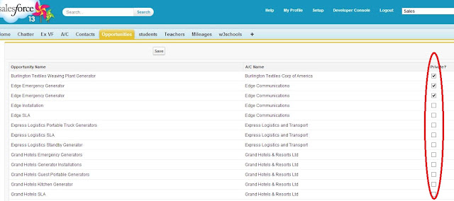
Visualforce Example:
<apex:page standardController="Opportunity" recordSetVar="opp" tabstyle="opportunity">
<apex:form id="changePrivacyForm">
<apex:pageBlock >
<apex:pageMessages />
<apex:pageBlockButtons >
<apex:commandButton value="Save" action="{!save}"/>
</apex:pageBlockButtons>
<apex:pageBlockTable value="{!opp}" var="op">
<apex:column value="{!op.name}"/>
<apex:column value="{!op.account.name}"/>
<apex:column headerValue="Private?">
<apex:inputCheckbox value="{!op.isprivate}"/>
</apex:column>
</apex:pageBlockTable>
</apex:pageBlock>
</apex:form>
</apex:page>

No comments:
Post a Comment